
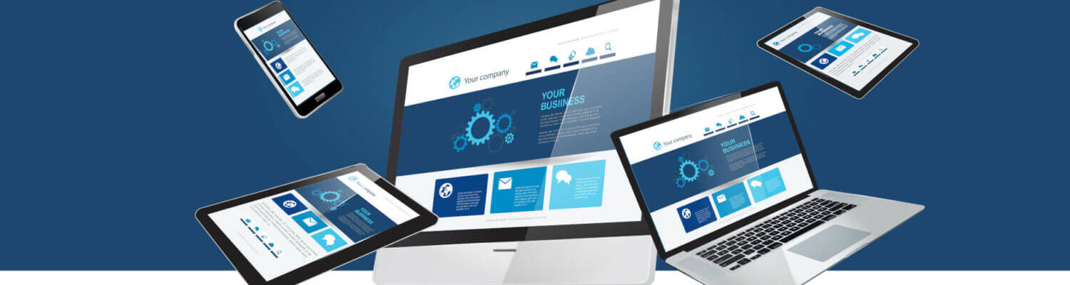
Mobile-Friendly Web Design & Development
Our mobile-friendly web design makes your website look good across all devices.
Our mobile-friendly web design makes your website look good across all devices.
Your website should look professional, load efficiently and be easy to use whether someone visits from a smartphone, tablet, laptop or desktop computer.
IDP provides mobile-friendly web design and development services for businesses that need websites built around today’s visitors. Our team creates custom responsive websites that automatically adapt to different screen sizes, making it easier for customers to navigate your content, explore your services and contact your business.
Since 2003, IDP has designed and developed websites for businesses in Kansas City and across the United States. We combine professional website design, responsive development and technical SEO to create websites that work across devices and support your business goals.

Mobile web design is about more than shrinking a desktop website to fit a smaller screen.
A well-designed mobile website should make important information easy to find, provide navigation that works with touchscreens and allow visitors to complete tasks without unnecessary frustration.
IDP develops responsive websites that adapt their layouts, images, navigation and content presentation to the available screen size.
Our mobile web design services include:
Our goal is to create a consistent experience across devices while making your website easier for customers to use.
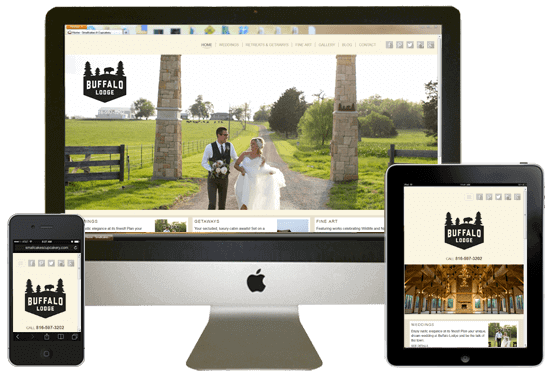

For many businesses, a customer’s first interaction with their website happens on a smartphone.
Visitors may be looking for business hours, comparing services, researching products, requesting a quote or trying to contact your company.
If a website is difficult to navigate on a mobile device, those visitors may leave before completing the action they intended.
Professional mobile website design helps businesses provide a better experience through readable content, accessible navigation, appropriately sized buttons and layouts that work without horizontal scrolling.
A responsive website also allows businesses to maintain one primary website rather than managing separate desktop and mobile versions.
Responsive web design and mobile-first web design are closely related, but they describe different aspects of website development.
Responsive web design allows a website’s layout and content to adapt to different screen sizes. A responsive website can work across smartphones, tablets, laptops and desktop monitors.
Mobile-first web design begins by considering the needs and limitations of smaller screens before expanding the layout for larger devices.
IDP uses responsive development techniques and considers mobile usability throughout the design process.
The objective is not to create a completely different experience for every device, but to make sure visitors can access important content and functionality regardless of how they reach your website.
If your existing website is difficult to use on smartphones, you may not need to start completely from scratch.
Some websites can be improved through targeted responsive development, navigation changes, layout adjustments and performance optimization.
Others may benefit from a more comprehensive redesign, particularly when the existing theme, framework or content structure creates significant mobile usability problems.
IDP evaluates the current website and its technical requirements before recommending an approach.
Our mobile website redesign services can include:
We focus on improving the website while retaining the functionality and content that remain valuable to your business.
Mobile usability is an important consideration in modern search engine optimization.
Google primarily uses the mobile version of a website’s content for indexing, making it important that mobile visitors and search engines can access the same essential information and functionality.
A mobile-friendly website should provide readable content, accessible navigation, properly implemented responsive layouts and efficient page loading.
IDP combines responsive web development with technical SEO experience to address issues involving mobile usability, content accessibility, website performance, internal linking and crawlability.
Responsive design alone does not guarantee higher search rankings, but a well-developed mobile website provides a stronger foundation for usability and technical search optimization.
Mobile visitors may access your website through slower connections or devices with limited processing power.
Unnecessarily large images, excessive scripts, inefficient layouts and poorly implemented interactive features can make a website frustrating to use.
IDP considers website performance during mobile development, including image optimization, responsive image sizing, layout stability and the efficient delivery of website resources.
We also review how visitors interact with important elements such as menus, forms, buttons and navigation.
The goal is to create a website that feels responsive and easy to use—not simply one that fits on a phone screen.
IDP develops mobile-friendly websites using platforms such as WordPress, WooCommerce, BigCommerce and Drupal.
For WordPress websites, we can create or customize responsive themes, page layouts and content components that work across screen sizes.
For e-commerce websites, mobile usability is especially important. Product navigation, filtering, product images, shopping carts and checkout experiences should all work effectively on smaller screens.
Our experience with both web design and custom development allows us to address responsive functionality beyond basic page layouts.
We begin by reviewing your website, business goals, target audience and mobile usability requirements.
Our team develops layouts, navigation and content presentation that work across a range of screen sizes.
We implement responsive functionality, optimize website resources and develop any custom features required by the project.
We review the website across representative screen sizes, browsers and devices, including navigation, forms, interactive features and content presentation.
After launch, IDP can continue providing website enhancements, performance improvements and technical support as your needs evolve.
IDP has been designing and developing websites since 2003. Our team combines professional web design with custom programming, responsive development and search engine optimization.
Our team develops websites using technologies such as HTML, CSS, JavaScript, PHP and responsive development frameworks, along with popular content management systems.
We develop websites around each client’s requirements rather than limiting every project to a standard template.
We consider responsive layouts, website performance, content structure and search engine accessibility throughout development.
IDP can help improve an existing website or develop a new mobile-friendly website, with ongoing technical support available after launch.
Based in Kansas City, Missouri, IDP provides website design and development services for businesses throughout the metropolitan area and across the United States.
Whether you need a new mobile-friendly website, a responsive redesign or improvements to an existing website, IDP can help.
Our team combines professional web design, responsive development and technical SEO to build websites that work for your customers across devices.
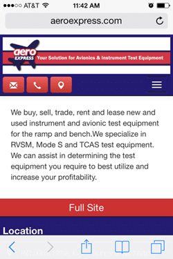



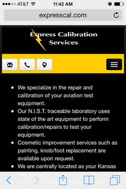
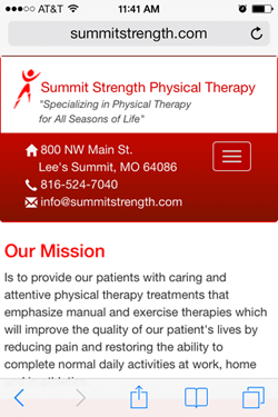


Mobile-friendly web design is the process of creating websites that are easy to view, navigate and use on smartphones and other mobile devices. It includes readable content, appropriately sized interactive elements, responsive layouts and navigation designed for smaller screens.
Mobile web design focuses on the experience of people using smartphones and other mobile devices. Responsive web design is a development approach that allows website layouts and content to adapt to different screen sizes. Most modern mobile-friendly websites use responsive design.
In many cases, yes. Some websites can be improved through responsive layout changes, navigation updates and other development work. Older websites with significant structural limitations may benefit from a complete redesign. IDP can evaluate your existing website and recommend an appropriate solution.
Mobile-friendly design supports usability and helps ensure search engines can access a website’s content on mobile devices. Google primarily uses mobile content for indexing, so important information should remain accessible across devices. However, responsive design alone does not guarantee improved rankings.
Usually not. Modern responsive web design allows a single website to adapt to smartphones, tablets and desktop computers. Separate mobile websites can introduce additional content management and technical complexity, so responsive design is generally the preferred approach for most business websites.
Yes. IDP develops custom WordPress websites and can create or improve responsive themes, page layouts and functionality for mobile devices.
Pricing depends on whether you need a new website, a complete redesign or targeted improvements to an existing website. The size of the site, content requirements and custom functionality also affect project cost. IDP evaluates your requirements and provides a proposal based on the scope of work.